MG4 EV vs Kia Niro EV: interior and infotainment
Credit to MG for what it’s achieved at this price point, it just doesn’t quite match the material quality and infotainment in the Kia
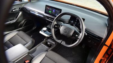
Inside, the MG4’s cabin is fairly minimalist, like a lot of EVs in this class, and material quality is a bit of a mixed bag. Key touch points like the indicator stalks and oddly shaped steering wheel feel nice and solid, and the top of the dashboard is fairly soft. Plus, there's a variety of textures and fake leather dotted around to help break up the black plastics. However, the plastics, especially those used for the lower dash and doors, are rock solid; hard-wearing, perhaps, but not especially forgiving.
That said, starting from under £26,000, you shouldn’t expect the MG4 to match the Mercedes EQS for material quality. And it is an undeniable leap forward from the bland interiors of MG’s other EVs, especially when it comes to technology. Every version of the MG4 gets a 10.25-inch touchscreen, which is a step up from the units in the ZS EV. The screen itself is crisp and clear, however, it often took two or three taps for it to respond when we drove the car. Apple CarPlay and Android Auto are standard at least, though neither are wireless.
Some of the on-screen toggles for things like the drive modes and regenerative braking are also pretty small, so it can be hard to adjust key settings like these on the move. The seven-inch digital driver’s display also features very small icons, but it does give you all the vital information you need. We like that MG stuck with large physical buttons for things like the heated windscreen and a shortcut to the climate controls, but it’s a shame it didn’t go the whole hog and fit a set of switches for the cabin temperature.
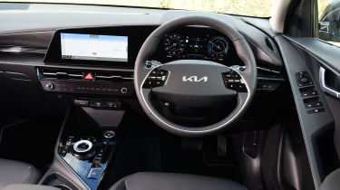
If you decide to spend the extra money on the Niro EV, you’re rewarded with a much better interior. All models feature two screens housed under a single curved panel – a setup pinched from the flagship EV6 – along with some clever touches and a few flourishes that make the cabin feel more premium. While the Niro’s dashboard is dominated by that pair of screens, the cabin also features ambient lighting buried in the dashboard, soft materials and marble-effect door panels. The touch points all feel high-quality, and everything feels well screwed together.
All but the base model come with a 10.25-inch digital driver’s display and 10.25-inch central touchscreen running Kia’s latest infotainment system. If you can afford to do so, we’d absolutely recommend stepping up – the bigger central screen makes a huge difference to perceived quality, appearing far-better integrated within the single-piece dash panel.
But whichever you go for, the infotainment is intuitive to navigate, boasting very crisp graphics and a responsive operating system. Overall it’s a much better setup than you get in the MG, but wired Apple CarPlay and Android Auto feature as standard, too, should you wish to by-pass Kia’s own system.

